Audience Dashboard
The Audience dashboard answers one question: who is visiting my website?
Instead of just counting visits, this dashboard helps you understand the people behind those visits: where they are, what devices they use, and whether they keep coming back.
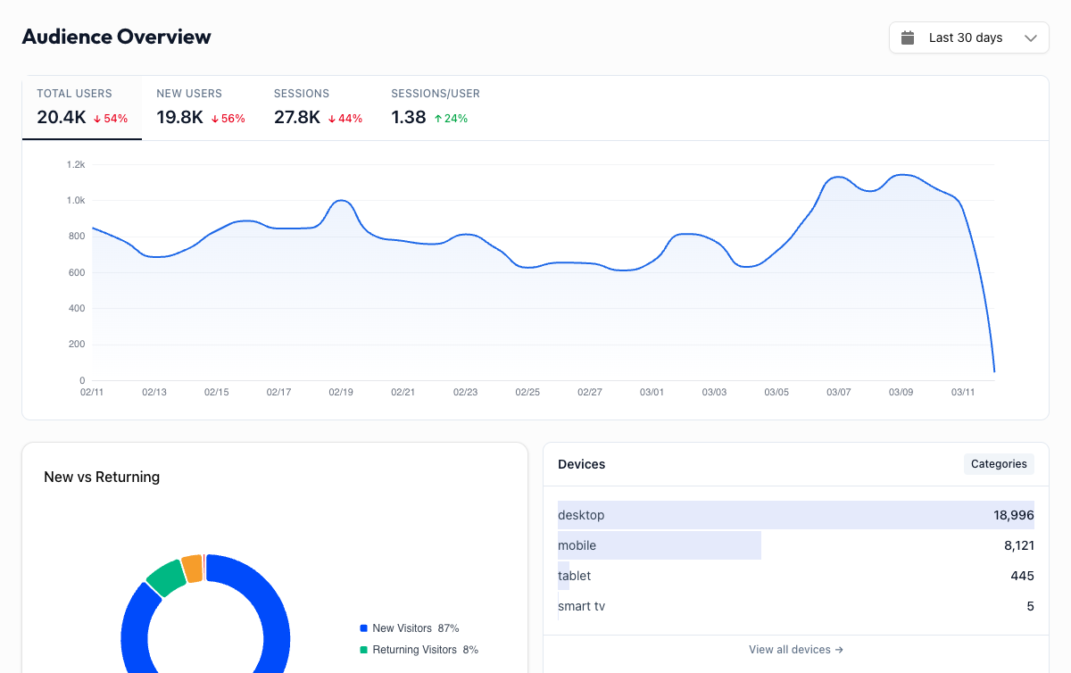
Overview Metrics#
Four metric cards sit at the top. Click any card to update the trend chart below it.
| Metric | What it means |
|---|---|
| Total Users | The number of distinct people who visited your site in the selected period |
| New Users | First-time visitors who have never been to your site before (within GA4's tracking window) |
| Sessions | Total number of visits across all users |
| Sessions/User | Average number of visits per person. Higher means your audience is coming back |
The trend chart shows your selected metric over time, with optional period comparison (dashed orange line) when you enable it in the date range picker.
New vs Returning Users#
A pie chart breaks down your audience into new and returning visitors. This ratio tells you a lot about the health of your site:
- Mostly new users means your content or ads are reaching fresh audiences, but you may not be retaining them.
- Mostly returning users means you have a loyal audience, but growth might be stalling.
- A healthy mix (roughly 60-70% new, 30-40% returning) usually indicates both acquisition and retention are working.
Watch this chart over time. If the returning percentage grows after you launch a newsletter or push notifications, that is a sign your retention efforts are paying off.
Devices#
The Devices panel shows which device categories your visitors use (desktop, mobile, or tablet). Click "View all devices" to explore the full breakdown.
Check your mobile experience
If 60% or more of your traffic is mobile but your site is not mobile-friendly, this dashboard is surfacing a real problem. High mobile traffic with poor mobile conversion rates is one of the most common issues this dashboard helps you catch early.
Geography#
A world map with a choropleth view (darker shading means more users) shows where your audience is located. Below the map, a ranked list shows your top countries by user count.
This helps you:
- Validate targeting: if you are running ads in Germany, you should see Germany near the top
- Discover opportunities: unexpected traffic from a country you are not targeting might be worth investigating
- Plan content localization: significant traffic from non-English-speaking countries could justify translated content
Click "View details" to see the full geography breakdown with city-level data.
Sub-Dashboards#
The Audience section includes three dedicated sub-dashboards for deeper analysis.
Geography
Interactive world map, country and city tables with user counts, session data, and engagement metrics.
Technology
Browser and operating system breakdown. See if Chrome dominates your audience or if Safari users need extra attention.
Devices
Device categories, screen resolutions, and the full mobile vs desktop vs tablet split with engagement metrics per device.
Practical Insights#
The Audience dashboard is most useful when paired with a specific question:
- "Should I invest in a mobile app?" Check the device split. If mobile is above 70% and growing, it might be worth it.
- "Is my SEO attracting the right audience?" Compare geography data with your target markets.
- "Are my email subscribers actually engaged?" Look at the returning users trend after sending a campaign.
- "Which browser should I prioritize for testing?" The Technology sub-dashboard gives you hard numbers instead of guesses.
Combine with Acquisition data
The Audience dashboard tells you who is visiting. The Acquisition dashboard tells you how they got here. Use both together to understand whether your marketing channels are reaching the right people.