Overview Dashboard
The Overview dashboard is your website's vital signs at a glance. It answers the most fundamental question: is my site doing better or worse than before?
This is the first screen you see when you log in. Think of it as your daily check-in, a 10-second scan that tells you if anything needs attention.
Metric Cards#
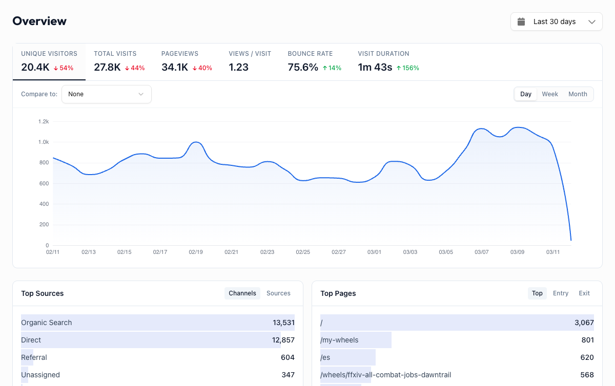
At the top of the dashboard, six metric cards show the numbers that matter most.
Unique Visitors
The number of distinct people who visited your site during the selected period. If the same person visits three times, they count as one unique visitor. This is your best measure of reach.
Total Visits
The total number of sessions across all visitors. One person visiting twice in a day counts as two visits. A spike here without a matching spike in unique visitors means your existing audience is coming back more often, which is a good sign.
Pageviews
Every page load counts as one pageview. If a visitor lands on your homepage then clicks to your pricing page, that is two pageviews. High pageviews relative to visits means people are exploring your site.
Views / Visit
The average number of pages a visitor sees per session. Higher is generally better because it means people are engaged enough to click around. A value below 1.5 on a content site might mean visitors are not finding what they came for.
Bounce Rate
The percentage of visits where someone landed on a page and left without doing anything else. A high bounce rate is not always bad (a blog post that answers someone's question is a "bounce" but still useful), but it is worth watching for landing pages where you want people to take action.
Visit Duration
How long the average session lasts. Combined with bounce rate, this gives you a picture of engagement. Short durations with high bounce rates on key pages are a signal to investigate.
Metric cards are clickable
Click any metric card to switch the main chart below to that metric. This lets you quickly spot trends for any number without leaving the page.
Time Series Chart#
Below the metric cards, a line chart shows your selected metric over time. This is where you spot trends, spikes, and dips.
- Click a metric card to change which metric the chart displays
- Hover over the chart to see exact values for any date
- Compare two metrics using the "Compare to" dropdown above the chart. For example, overlay Unique Visitors and Bounce Rate to see how engagement changes as traffic grows.
When period comparison is enabled, the previous period appears as a dashed orange line. This makes it easy to answer "is this week better than last week?" without mental math.
Granularity Toggle#
Above the chart, a toggle lets you switch between Hourly, Daily, Weekly, and Monthly views.
| Granularity | Best for |
|---|---|
| Hourly | Watching traffic during a launch or campaign (use with a 1-day or 7-day range) |
| Daily | Your default view for most date ranges |
| Weekly | Smoothing out day-of-week noise over 30-90 day ranges |
| Monthly | Long-term trend analysis over quarters or years |
Hourly granularity works best with shorter date ranges. If you select "Last 90 days" with hourly granularity, the chart will be very dense. Switch to daily or weekly for longer ranges.
Comparison Mode#
Enable comparison in the date range picker to overlay the previous period on every chart and metric card. Each metric card shows a percentage change (green for improvement, red for decline), and the chart adds a dashed orange line for the previous period.
This is the fastest way to answer:
- "Did that blog post I published last week actually move the needle?"
- "Is traffic up this month compared to last month?"
- "Are we trending in the right direction?"
Summary Tables#
Below the chart, four summary panels give you a quick snapshot of your traffic breakdown without needing to visit each dedicated dashboard.
Top Sources
Shows where your traffic is coming from, with tabs for Channels (Organic Search, Direct, Social, etc.) and Sources (specific sites like google, facebook, twitter). Click "View all sources" to go to the full Acquisition dashboard.
Top Pages
Your most-visited pages, with tabs for Top (by pageviews), Entry (first page people land on), and Exit (last page before leaving). Entry pages tell you which content is attracting visitors. Exit pages tell you where you might be losing them.
Locations
A ranked list of countries your visitors are coming from. Click "View all locations" to explore the full geography breakdown on the Audience dashboard.
Devices
A quick look at which browsers, operating systems, and screen sizes your visitors use. Tabs let you switch between Browser, OS, and Size breakdowns.
Make this your morning routine
Open the Overview dashboard with your coffee each morning. A 10-second scan of the metric cards and a glance at the chart tells you if anything changed overnight. If a number looks off, click through to the relevant dashboard for details.