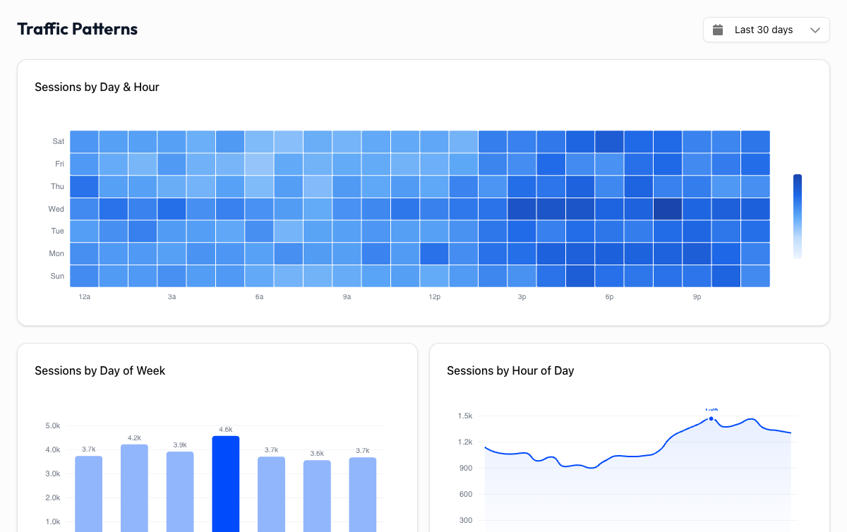
Patterns Dashboard
The Patterns dashboard answers a simple but powerful question: when is your website busiest?
It shows your traffic patterns by day of week and hour of day in a visual heatmap, so you can see exactly when your audience is most active.
The Heatmap#
The heatmap displays a grid with days of the week on one axis and hours of the day on the other. Each cell represents the traffic volume for that specific day-and-hour combination.
Darker cells mean more traffic. Lighter cells mean less. Hover over any cell to see the exact number of sessions for that time slot.
At a glance, you can spot when your site gets the most attention and when it goes quiet. The pattern is often surprisingly consistent once you have enough data.
How to Read It#
Look for clusters of dark cells, which mark your peak traffic windows. Then look for the lightest areas, which mark your quiet hours.
Most sites have a recognizable rhythm:
- B2B sites typically peak Tuesday through Thursday, between 9am and 5pm in their primary audience's time zone. Traffic drops off noticeably on weekends.
- B2C sites often see stronger traffic during evenings and weekends, when people have time to browse and shop.
- Global sites may show multiple peaks as different time zones wake up and go online.
Your pattern won't match these examples exactly, and that's the point. The heatmap shows your audience's behavior, not a generic template.
Practical Uses#
Publish content when your audience is online
If your heatmap shows a consistent spike on Wednesday mornings, that's when your audience is already on your site. Publishing a blog post or launching a campaign at that time gives it the best chance of being seen immediately.
Schedule social media around peak hours
Social media posts that drive traffic to your site work best when your audience is already active. Use the heatmap to align your social posting schedule with your website's busiest hours.
Spot unusual patterns
The heatmap also reveals anomalies. Traffic that drops every weekend is expected for a B2B site. But if your B2C e-commerce site goes dead on Saturdays, something might be off. It could be a technical issue, or maybe your audience isn't who you think it is.
Plan maintenance windows
Need to push a deployment or run database maintenance? Pick your quietest hours. The heatmap makes it obvious when the fewest visitors will be affected.
Use at least 28 days of data
Short date ranges can produce misleading patterns. A single busy Tuesday could make it look like Tuesdays are always your peak day. Select at least 28 days (ideally 90) to see reliable, repeatable patterns. The longer the range, the more you can trust the heatmap.
Time Zone#
The heatmap uses the time zone configured in your GA4 property. If your audience is global and you see a broad spread of activity across many hours, that's normal because you're seeing overlapping time zones compressed into one view.
If you primarily serve one region, the pattern will be more concentrated and easier to act on.
How does yours compare?
B2B sites typically peak Tuesday-Thursday, 9am-5pm. B2C sites often peak evenings and weekends. Check your heatmap and see if your traffic follows the expected pattern, or if your audience has a rhythm all its own.